Museum Artist Retrospection App - Holly Coulis
Project Outline
Duration - 2 weeks
UX Methods used - Research, Ideation, rapid prototyping, Testing
Tools used - Figma
The Assignment - As commissioned by an Art Museum, design a mobile application interface ahead of a retrospective of an artist's work showcasing both the artist's work, in the app, and providing a sketching tool so patrons can feel what it is like to be the artist. Understand the user need as well the business needs.
The Research
What is an Artist’s Retrospection?
Before starting I had to find out what retrospective meant. Retrospective means looking back. An art exhibit that covers an artist's entire career is called a retrospective because it looks back at the work the artist has produced over many years. Retro- means back, -spect- means look (think: spectacles), so the word means literally 'a looking back.
Holly Coulis - The Artist
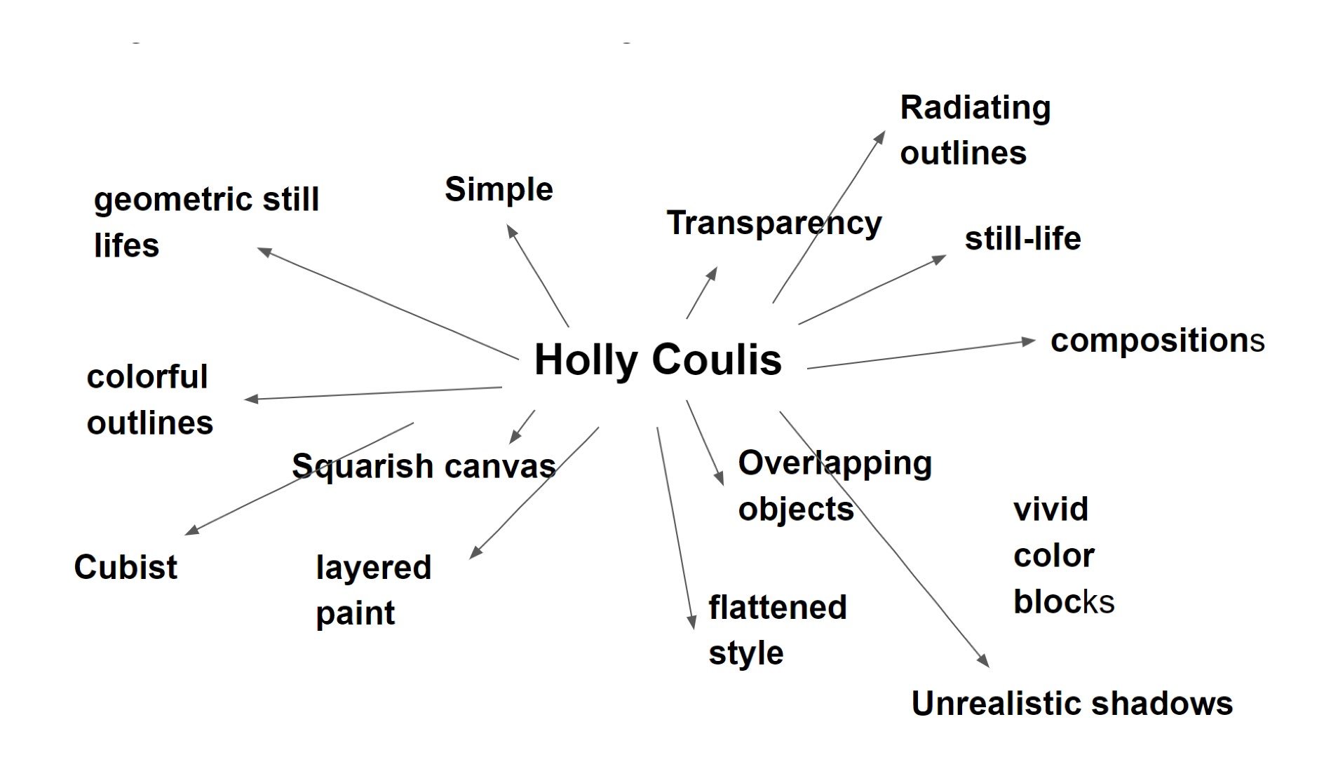
After researching many artist journey I decided to go with Holly Coulis. Born in Toronto, Canada, Her style is color-saturated, geometric still lifes combine classical subject matter with a Cubist sense of perspective; while her work depicts the household objects of traditional still-life compositions, her predominant interests are in color and line. She renders pitchers, cats, and fruits in a flattened style with many colorful outlines. Her layered paint, vivid color blocks, and bold, graphic linework create an atmosphere of exuberance and unreality.
Holly’s Art Journey Over the years
From the year 2001 till now we see a drastic change in choice of composition, movement from real to abstraction, and color choices.
I could largely divide her works into four main categories.
Early landscapes
Portaits
Realist Still Life
Abstract still life
Holly’s Art Personality
Trying to decode her most latest art style
A museum Goers Journey mapping
An attempt to understand my user, by looking at their actions, experiences and finding improvement opportunities.
Understanding user patterns , needs and
opportunities
Ideation
Designing the Site map- My next step was establishing a site map that reflected the user’s goals and business needs. About the artist talked about holly and the art journey in years, for easier understanding. Work was categorized by year, medium, subject, and price. there was an option to buy/ inquire about original art on each product page. the gift shop is connected to the drawing app. As buying souvenirs is a big part of the museum business and the last step user’s journey, I decided to add a monetization option from the drawing app.
Search, FAQs, Shipping info, Product care, etc would be part of the secondary navigation or the footer.
Site Map
Establishing the flow- following the principles of design psychology, like (people are inherently lazy, and look for shortcuts, if the shortcuts are easy. or people are motivated by social norms. or people are motivated by autonomy), I established the user flow.
User Flow for drawing application
Wireframes
Finally, I started working through my designs and iterating them as needed. I wanted to give easy main navigation and interconnected pages for more through browsing. I used familiar patterns, clear heading for the user to know where they are on the app. the search feature and Basket is visible at all times for any unknown search.
For the drawing app, I drew inspiration from Scanning apps. I understand the user may not be a pro artist or use a stylus for drawing. hence an option to click high contract pictures and select objects for drawing. the app has prepopulated canvas settings, color themes that give constrained control to the user. (we don’t want them to go crazy with options)
Finally, the patrons have an option to bring their designs to life, wear them as a T-shirt print or decorate them as a pillow or gift the artwork on a tote bag.
Critique
The designs were presented for peer critique session. Some issues like
insufficient touch target (fat finger)
layout as a site/ app
Unclear drawing app task flow.
Final Design
Finally after several rounds of iterations, below is the final design. The primary navigation has more clear entry points. The user may choose the Hamburger menu anytime during their app experience. Artist works are now displayed as an in-gallery walkthrough experience. For better understanding check out the interactive prototype.
Check out my interactive Museum Retro App
Final Takeaway
It was interesting to tackle a design problem from a design psychology standpoint i.e what motivates people, how people make mistakes etc. Also, Panning out the drawing tool really got my brain working. I may carve out a user flow before on paper but unless I draw the screen (Lofi) and ask what other course of action would the user take, it wouldn't be complete. Just the right amount of challenge.
Exploring different apps (like the scanner app or Vistaprint website) for this assignment also helped me pan out for features and task flows.
The design underwent multiple critiques and iterations, I now handle critiques more productively and with optimism. One product feature that underwent maximum change was the gallery feature. From just simply laying out the artwork in a grid style to a walkthrough feature that arouses user interest and curiosity.
One constraint I faced was not being able to visit a museum for research. I would have loved to visit an actual retrospective and understand the process better.
In the future, I would like to explore the Augmented Reality angle in the application. My lack of knowledge (applications and tools) and time constraints stopped me.


