Redesign Site Architecture- Amoeba Music
Project Outline
The Assignment- Amoeba music is looking to adapt its strategy due to the pandemic and is looking to revamp its site structure for first-time users. Redesign site for easier wayfinding and less clutter.
Duration: 4 weeks
UX methods: Automated Crawl, User Research - Card Sort, Tree test, Ideation, rapid prototyping
Tools: Figma, MS Excel, Optimal Workshop
The Research
Understanding Amoeba Music - The Brand
Amoeba music, a well-known record store in California is looking to revamp its digital presence in COVID times. Especially for their first-time users, aiming to grab attention and make wayfinding easier.
From the first look, the website looks cluttered, too noisy, and confusing. there are multiple categorizations on the page and the brand offers various music/movie options. I decided to dig deeper going into sub-levels and understand the workings.
First Impression-
Cluttered
Retro
Non legible text
Lacks focus/ Too busy
High visual noise
Too much information / confusing
Confusing filters and subcategorization.
Images lack alt text
Non legible text. The site is very busy making the contents/ actions links too small. User may need to squint to look for / read text.
Confusing Actions - To buy a CD or LP the user first has to click on “BUY” then select the desired Music player type.
Non-consistent display of information: the site layout is inconsistent, again leading to confusion and frustration due to unpredictive attributes.
There is much more to the website than just selling music. Amoeba Music does the following for their audiences-
users can BUY and SELL music CDs/Vinyl
look at staff recommendations
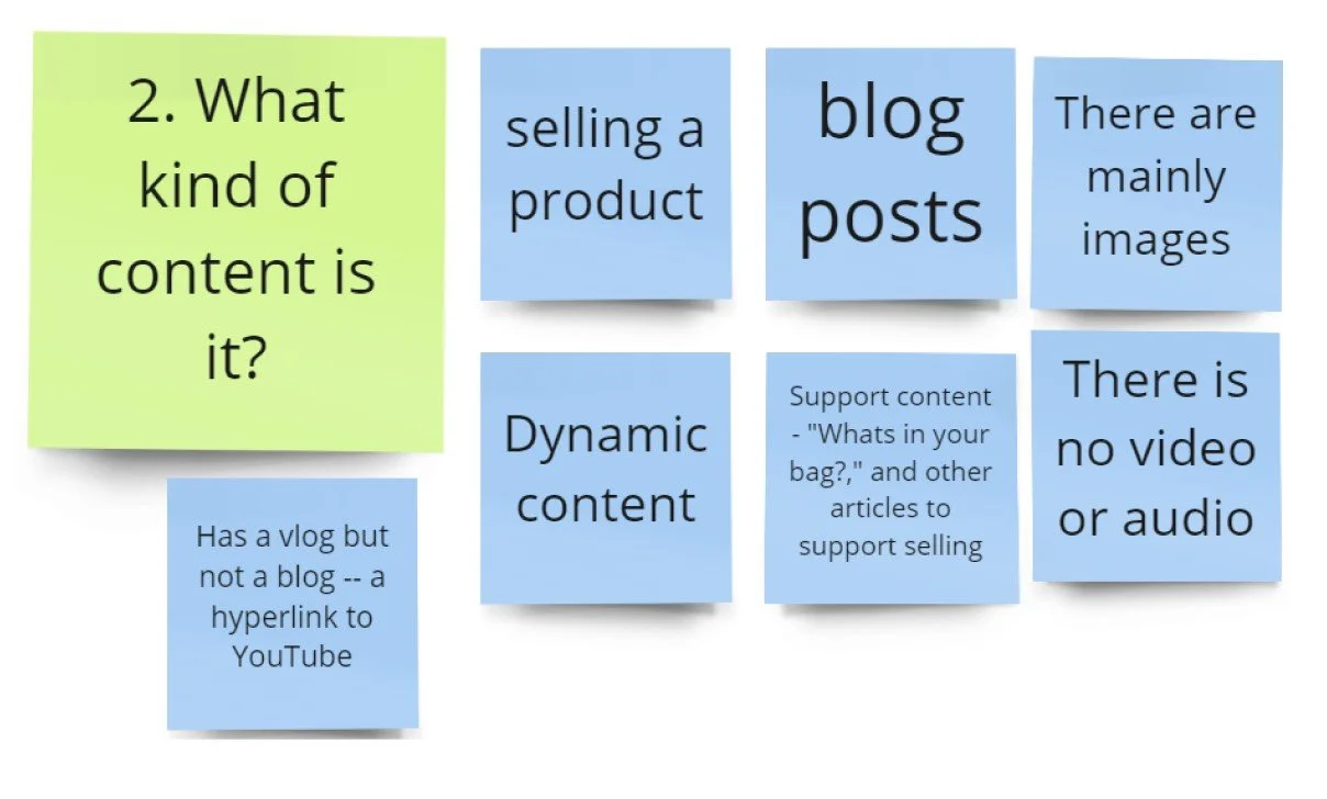
V-blog called What’s in my bag - showcasing what famous artists buy at Amoeba store.
Join vinyl club
Buy merchandise.
After briefly going through the site- the process of decoding the site structure or architecture begins. We were given an Automated Crawl Report in Excel. This report gave me a quick brief of the category volume, links(external and internal broken and non broken), Scope and title information.
Automated crawl report in MS Excel
The crawl led to the following questions-
The next step was to pan out the existing site map-
with the site map i could place the main navigation, secondary navigation. Highlight repetitions of content and areas of discrepancies, and scope of improvement.
After briefly looking at the website and crawl it is time to look at the User (First-time user).
To gain a better understanding of how people organize the information I conducted an OPEN and MODERATED card sort. The Participants were allowed to make their own categories.
For complete results visit - https://app.optimalworkshop.com/optimalsort/84701jdx/zjiaav6c/shared-results/c703hrr87222856h6bl8n2iacachql12
Participants Overview
Cards
Result Analysis
Dendrograms
Findings from Card sort
New users connected “What in my bag?” to “Checkout cart”
Ask questions during the sort and prompt participants to think out loud to better understand their thought processes.
Gift certificates were clubbed with store discounts rather than Merch.
Avoid keyword matching when designing questions. like participants grouped all items Coldplay by Coldplay and not by item type.
Users seek cross-category buying. eg when looking for Coldplay albums, they would like to see “Coldplay” merch as well.
Users grouped facemasks and Covid guidelines. This cross-category is an opportunity to push merch forward.
These findings are the basis for the initial groundwork for the site architecture. Based on the card sort insights, the following categories emerged. - MUSIC; MOVIES; GIFT SHOP; TRENDING- News, Trending Charts, Amoeba recommends; SELL/TRADE; EVENTS; ABOUT THE STORE; SOCIAL LINKS
The site map was further critiqued to make a more robust site structure before starting the tree test.
HMW Give weightage to “what in my bag?” for new users
Explore more on terminology- Merch Vs Gift Shop
HMW we denote that trending items can be purchased?
Proposed site map (part 1)
Questions asked during critique
The proposed site map is put to an evaluative test by TREE Test in Optimal Workshop. The participants are given certain tasks that they have to complete via the new site map. The test measures the following-
Amount of time taken to complete a task
Path followed
First Clicks
Success rate
Directness
Overall task score.
Tasks and their corresponding correct path
Tree main level
Findings from Tree Test
When asked to shop for music 40% of participants choose ‘Shop’ instead of the ‘Music’ category. ‘Shop’ confuses the user. A non-generalized nomenclature for SHOP- that says users can buy music merchandise and not music.
Users identified information related to Live events correctly Under EVENTS.
Participants found store-related information correctly under About the Store.
Participants failed (35%) when asked to exchange old vinyl for new. they choose to look under Music, About the store, and Shop.
When asked to locate merchandise by Artist the users ignored Select by Artist and went directly to merch type. and better-proposed way to be to show more merch by the same artist on a specific merch type page.
participants had trouble searching information via genre (Genre instead of information finding becomes more like knowledge for users.)
Participants could easily identify the correct path for movies related questions.
Path taken by users for task 5
Tree test findings led to the following changes-
‘Trending’ to change to ‘explore’
Added merch by artists
Moving trending music and recommendations from ‘trending’ to ‘music’
The Design
Lo Fidelity design
Final Design


